This is my questionnaire for my Digipak:
Like my questionnaire for my music video this is handed out to 30 people, 15 males and 15 females. I will also post the results in a future post.
Showing posts with label Research and Planning. Show all posts
Showing posts with label Research and Planning. Show all posts
Questionnaire for my Digipak
Questionnaire for my Advertisement
This is my questionnaire for audience feedback for my magazine advertisement:
Exactly as I did for the other two questionnaires I have handed them out and will be collecting them and posting the results in a post in the future.
Questionnaire for my Video
This is the questionnaire for the feedback about our video:
This was handed out to 30 people, 15 males and 15 females.
I will collect the results and post them in a future post.
Pop; One.

This album cover 'Pop' is very similar to my design, the colour scheme, the effects and the general points of interest all coexist with my ideas.
Minus the blue background rather than black the whole idea of the album is spookily close to mine, it has a portrait that is pink and has markings on it, near to sequins or glitter and the hair is very similar, whilst they use the idea of a different font like i tried to create, since this writing is very unique and i have never seen any other album covers with the same font, this makes the album cover more appealing since it shows they are alternative and don't follow the same ideals as everyone else, an image that i also tried to recreate.
My Questionnaire.
To help make my digipak the best it could be i have made a questionnaire to find out what people like/dislike and are/arent attracted to in an album cover. I handed out 30 copies of my questionnaire and here are my results;

Gender: The female to male ratio is very biased. There are only 9 males: 21 females which means that less then a third of my questionnaires will represent the male views on album covers. However i could use the fact that more females would prefer to listen to the band, due to the feminime lyrics and powerful lead female vocals.

Preference to digipak: Similarly to the graph above, the ratio is very uneven, this time however since its due to opinion it is not detremental to have to adapt my album cover. The 10 people that chose Jewel Case Cd's compared to Digipaks wrote many different reasons as to why they prefer this option, some claim that they preferred 'having less space with just the two sides of the cd case rather then the never ending panels on some digipaks' and oone person said that they 'just buy the cd for music and do not need or want the extras that some digipaks provide.'
Overall most people would prefer a Digipak, because its 'modern and easier to store' and 'gives you bonus features and interesting information on the artist or band' compared to the standard jewel cases.

My Band.

When listening to our song, i have always thought of the singer being part of a band rather then just a solo artist, its a usual sight that the main singer of a band is the most popular and recognisable member, which means that most people are fans of the singer rather then the band all together, and interviews and other projects are often done as a solo thing. Its also a very reoccuring thing that the lead singer is female, examples include;

Hayley Williams; Paramore, Elly Jackson; La Roux, Beth Ditto; Gossip, And Florence Welch; Florence and the Machine.
This shows that even if i chose a band then its likely that the lead female singer will be the iconic image if the band were mentioned. Another positive of having a band rather then a solo artist are that a band will enable more people to relate to the band, perhaps certain members could be personal favourites to different people, creating more fans and also making a bond between the other members, which could feel less superior to the lead singer, that usually has all the attention. This will help to make all the features of my Band, album cover and Music video become realistic and effective.
CLC visit number two.

Our second trip to the City Learning Centre gave us the oppurtunity to edit our film with a professional near by, able to help us with any problems that we have or any questions we might want to ask. This was helpful since as mentioned before we werent very confident with the new version of iMovie and the online tutorials couldnt answer all the questions we had.
When talking to the people at the CLC we were told firstly that our transitions were too slow and werent going with the beat, which was important so as not to make our music video look sloppy or unprofessional. We were quickly helped by being introduced to 'Beat Markers' which was a simple marker that you can drag onto your clips which would automatically change the time of the clip in order to make sure that it didnt miss the beat or go on to long.
We were also informed that our hopes of imatating the technique used in Blink 182's video of having three different sections to the clip, to show off the three boys, it wasnt possible due to the programme we had, something that we will have to change on our storyboard and work round, finding alternative ways to show off the three dates. Possibly a wipe across the scene, which if timed right could look just as effective.
I think that the trip has helped us, because it enables other people that are professionals to look at our video and give us constructive criticism, and to let us know things we are or arent able to achieve; another example being the fact that our video is very grainy in some scenes, we were informed that we couldnt actually use any type of programme on the computer it has to be done when actually filming, which means that we can remember this for future projects, to help us get a more proffesional result.
All Time Low.
When looking at Pop/Rock Album covers there was one band whose Album covers always stood out. All time low, an american band fall under the same genre as the song for our music video. Before researching about Pop/Rock bands i had never heard of them or any of their songs.
If i were to see these album covers in a shop then i definitely would have wanted to pick them up. They all vary in design,
So Wrong its Right, All Time Low.

This album cover is bright, it has three main colours; Yellow, red and Blue, contrasting with eachother they send off the image of summer, due to the yellow and red being warm colours and the blue as a very small section which could represent the sea or water, something that is strongly associated with summer ie. the beach. The black figures are bold against the background and they attract your first attention, its as if they are jumping, making it seem as though they are elated, perhaps at the album or even reiterating the point of summer since people are often happier in the summery months. The other feature of the cover is the birds that are flying across the whole cover, they fade at different parts and are consitent from one end to the other. These birds have no obvious relevance to the title or the rest of the album cover but its similiar to the colors since it is a contrast to the people and the images in the background. This album cover has features that are opposites crushed together, which makes it interesting and sets the cd off as unconventional which often results in the potential buyer more tempted to pick it up and have a look.
Nothing Personal, All time Low.

This is my favourite out of the three album covers. In a way its simpler then other two, yet more complicated! The image is like wallpaper that has been split into two, crushed in between is the bands name in a huge black block font and the album name as if it has been written by hand, it is very inferior to the band name. The other insides of the album cover include to our eyes random objects, the end of a pencil, an american cinema ticket, a pair of legs and a casette player are a few to name, none of the objects are in full yet we are still able to identify the majority of them. The objects are not bright coloured at all, they are all quite neutral tones that dont really leap off the cover yet it makes them all blend together making all the items flatter eachother and work well all together as well as seperately. There is also the repetition of the birds on this cover, like the 'so wrong its right' cover which could show that its a theme that the band are using to associate themselves to this image, in turn this could make a connection for fans, so that when they see the flock of birds they automatically think of All Time Low. I think that the fact they have such a simple yet busy album is fun and fascinating, as a potential buyer i would be curious about what else is there and why, by making the viewer think about what they are looking at has enabled the band to once again make an interesting and effective album cover.
Put up or Shut up, All Time Low.

The final Album by All time low, is equally as eyecatching as the other two. The main person in the front has no facial features and is the only one in colour, this could be as to not attract the viewers attention away from the album names situated above and on the man. I think that the contrast between the other people and the man in the middle creates an image of individualism and once again the unconventional side of the band because he isnt the same as the others and stands out, making sure that the person looking at the album cover sees the seperation in a positive light rather than negative. It has similar features to both the above, for example; just like 'Nothing Personal' this cover has a HUGE focus stealing band name and an understated, 'handwritten' title. Alike 'So wrong its right' it has bright colours that will stand out when its amongst thousands of other cds and albums in a shop. It appears that the band like to keep their album covers close to eachother by using a lot of the same effects; the birds, the fonts and the colours all show that the band has consistancy but still allows room for change so that the fans and buyers can see a comfortable changing band.
Im going to use All Time Low's album covers for influence when it comes to designing my own album cover and i hope that i can achieve the kooky and fun yet complimentary edge to my album cover like they have, three times!
Album Covers and Digipaks

One of our individual tasks is to make an Album cover, more specifically a Digipak. In order to do so i will have to understand exactly what is needed for a Digipak Album Cover.
Wikipedia says a Album Cover serves three main purposes;
'1. To advertise and identify the contents of the music product.
2. To convey the artistic aspirations of the original artists
2. To convey the artistic aspirations of the original artists
3. In reproductions of the artwork, to serve as a primary image in the promotional efforts surrounding the product, as an identifiable image associated with it.'
and that a Digipak is;
'typically consist of a gatefold(book-style) paperboard or card stock outer binding, with one or more plastic trays capable of holding a CD or DVD attached to the inside'
After looking at a variety of websites, most of which showed usually the same thing as the one before, i found that a digipak is similar to a old school jewel Cd case, except this time it can have more than 4 panels, typically around 6 or 8 panels. This often contains information, pictures and sometimes more discs with extras on it and other attributes to help promote the band/artist. Due to moving trends, bands tend to have this lightweight and tougher option when designing there album covers, resulting in an increase in the popularity of Digipaks.
Analysis of Album Covers.
Here are two examples of Albums covers that i have analysed, Kelly Clarkson falls under the Genre of Pop/Rock and although No Doubt have songs that would also go under the same title, the band generally are classed as Rock or Ska, Gwen Stefani, the lead singer however is known as a Pop Rock Singer as a Solo artist so i found it useful to analyse these two covers.
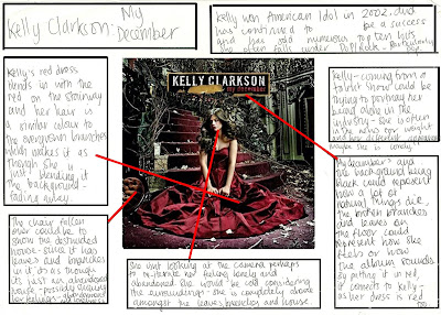
My December, Kelly Clarkson
Tragic Kingdom, No Doubt

Final Storyboard.
On Monday 23rd, we finally finished our storyboard, we finished all the drawings and made sure that each shot had annotations of camera angles, transitions and lighting.
Now we have finished the storyboarding we are able to see exactly how our video is going to be, every moment has been recorded which will make it easier for us to film and then eventually edit.
Our annotations;


Props!

In today's lesson we made one of our main props, the speed dating sign that shows the audience what is happening in our music video. The features of the sign that we decided were most important was that whilst conveying the information, it also needed to show some type of connection with the song lyrics, we made this possible by making features of the font have 'devil' connotations, for example the devil horns on the word 'Saucy' which relates to the line,
'The man is a dream, the devil did him a deal'
As well as the S in the word Speed having the stereotypical devil tail, in a triangle also connection the reference to the devil.
We de cided that the font should be red since it could be relevant to Love= the couples dating and the eventual outcome of our video, The devil= red is usually the colour of any images of devils that you usually see and red could also represent danger which intertwines with the lyrics, that 'superman' could possibly be quite risky.
Gwen through the ages.

'It was such a turning point to find that I had a talent and I had something to contribute, somewhere.'- Gwen Stefani
In 1986 a band was founded that catapulted Gwen Stefani into a world of Celebrities and the rock star lifestyle. No doubt weren't an instant success and it wasn't until the 90's that they really started to make waves. With hits such as 'I'm just a girl' and 'Hey baby' and the band stayed strong, until 2003 when Gwen made a suprise decision to go solo,
'I never for one minute thought that I'd go solo.'
Gwen had an eight year relationship with band member Tony Kanal, with a break up that inspired the songs 'Dont speak.'
Now a solo artist Gwen, determined to make it big collaborated with stars such as Eve for 'Let me Blow your Mind', Akon for Sweet Escape, Pharrell for 'Can I have it like that' and Damien Marley for 'Now that you got it' and has since released Two Albums L.A.M.B(2004) and Sweet Escape(2006.) In 2002, Gwen married band member of Bush, Gavin Rossdale. Gavin already had a daughter, Gwen's Step daughter, Daisy Lowe with British fashion designer Pearl Lowe. They have been married for 7 years and have two children, Kingston,3 and Zuma,1.
'I remember when I was in school, they would ask, ''What are you going to be when you grow up?'' and then you'd have to draw a picture of it. I drew a picture of myself as a bride.'

Other Projects
 ancers that she constantly has with her when it comes to music, in her videos and on her tours. She gave them new names; Love, Angel, Music and Baby, referring to her Album title.
L.A.M.B is also the name of Gwen's popular Clothing, Shoe and Accesory range and her newest product Perfume. She has branched out from being just a singer and it has paid off, as Gavin and Gwen were in the top 20 forbes list of Richest celebrity couple in the past years.

In 2005 she expanded her collection with the less expensive 'Harajuku Lovers' line, which she referred to as "a glorified merchandise line" products include cameras, mobile phone charms and underwear at affordable prices.
'L.A.M.B. is a fashion line that - fingers crossed - will just get more and more sophisticated. What's different than what's out there is the way I put things together. And, if you look inside the pants, you'll find secret details in there.'
The newest result of the 'Harajuku Lovers' range is the perfume in bottles shaped like herself and the four harajuku girls them self with their L.A.M.B names and her own being 'G.'.
Gwens Appearance
 band member to a successful solo artist, she has gotten married and become a mother, but the most severe change is her appearance. It may be due to the constant media coverage of her and the pressure on her to fit in but Gwen Stefani changed from a geeky, pink haired, braced Individual to a glamorous, chic lady. Before anybody could influence Gwen on her style she seemed to have an air of ‘I Don’t Car
 e!’ about her and chose to wear whatever she wanted. But nowadays it’s sometimes hard to tell the difference between her and all the other clone celebrities, with blonde hair and flawless make-up. However she has still kept her own twist to her style and is often seen in something outrageous to remind us that she is still as kooky as she ever was!
Storyboarding again...
We continued our storyboard drawings today and we still haven't finished but we have made great progress but we did discuss the ways in which we will continue with storyboarding and hoping to stick at the same level as we have maintained so far.

Location, Location, Location.
The setting is almost equally important as costumes and although most of the video will be filmed in domestic situations there will be scenes outside of that. We decided as a group that those places should be specific for the characters;
The gym would be a good location for the 'Hunk' as it is a place for show off's, and since he is supposed to be arrogant- strutting his stuff in the gym seems appropriate.

The Geeky guy gets to go to the library since that is the image mostly associated with geeks in the media so the audience would relate to this setting.

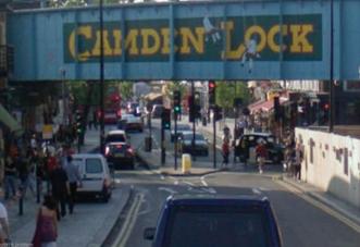
And where else for the 'Goth' then what could be considered goth central- Camden. Its where you are most likely to find a heavy eye-liner-ed, dressed in black goth/emo and it would be foolish not to put our goth character there.
Costume Design.
We have looked at the costumes for the four main characters; The Girl and the three dates as they will be important if we want to get their image across. We discussed how they would have to be quite stereotypical when it comes to the date to make sure that there is a noticeable difference between the guys.
Reena Chadee came up with these character montages;
For the Girl; 'Through the study of semiotics, the personality of this character is apparent. This is shown by her casual clothing which reflect her cool attitude. Moreover, like a majority of female teenagers it is obvious that this character is interested has interests in fashion. '
For the 'Goth' Guy (me); 'This character pursues the role as a punk. The black garments embrace connotations expressing a sinister appearance. On the other hand, the heavy make up acts a disguise which suggests that the this character is not confident.'
For the 'Geeky' Guy; 'This character would be categorised as the 'geek'. This is because of his old-fashioned style, which mirrors his personality and lifestyle. Nevertheless, these traits change throughout the video as he is motivated to be more confident, hence the Superman costume.'
For the 'Hunky' Guy; 'At a first glance this character appears to be similar to the female protagonist, this is because of their fashionable clothing and modern style. However, the various designer items have connotations of an arrogant attitude.'
Whose in it?
The decision of who is going to be in our video is based on factors such as; the ability to stay in role for a long period of time, availability, and general image but then also we have decided that as a group we should all make cameos in it, with that in mind and the fact that the characters should be aged between 10 to 19 in order to relate to the audience this is the list of characters;
1. Female - Reena Chadee
2. Boy Date (Punk) - Me- Robyn Oliver
3. Boy Date (Hunk) - Mike
4. Boy Date (Geek) - Krishna Mootoosamy
5. Young Boy- Cameron
6. Devil- April Mckay
7. Screaming Girl- Laura Fredericks

Even More Storyboarding...
Now we have the timings for our video we needed visuals, by using a storyboard template we began drawing the 'Blink182' and 'Powder' inspired beginning.
As a group we have decided that any information relating to the camera angles, movements, transitions and timings should be written last just in case we decide to make changes, it will be a lot simpler to change them if we haven't got them recorded for permanent referral.

The storyboarding continues...
We have finished the outline of the storyboard, so now we know exactly what is going to be filmed for our video, obviously allowing for changes, since we have already made minor changes to the plans we did yesterday.
Here is the rest of the timings;

The storyboarding begins...
With a lot of random ideas our group discussion started as a mess of everyone's personal opinions of what should be in the video, it didn't seem like an effective way of getting our storyboard done so we decided that we should go through the song and decide what should be happening in measure of seconds so that we have accurate and precise shots.
By doing this we know exactly what should be filmed for every second of the video, however it is a very tedious job and it takes a long time to go through a 3-4 minute song second by second.
Here is what we have done so far;
We will continue and hopefully finish the storyboard when we meet tomorrow. (20/10/09)
Subscribe to:
Comments (Atom)

