
This album cover 'Pop' is very similar to my design, the colour scheme, the effects and the general points of interest all coexist with my ideas.
Minus the blue background rather than black the whole idea of the album is spookily close to mine, it has a portrait that is pink and has markings on it, near to sequins or glitter and the hair is very similar, whilst they use the idea of a different font like i tried to create, since this writing is very unique and i have never seen any other album covers with the same font, this makes the album cover more appealing since it shows they are alternative and don't follow the same ideals as everyone else, an image that i also tried to recreate.
Pop; One.
More Digipak...
This is the last side to my Digipak, its not very interesting since it just holds the CD, i think that the design of the CD will be important to and since it will be covering the majority of this side then it will be more of a necessity to be appealing than having a lot of images on this side.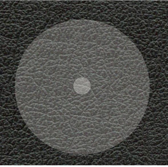
I will be posted a design for the CD at a later date, which will then be the focus of this slide.
Digipak...
 This slide is a single image but this has the word 'Blah' written in the same font as the title and band, these is to make sure that there are connections throughout the album cover, as well as just the images. I had used the letters in the exact same way as the cover but enlarged it more to make sure that the side wasn't to bland and empty.
I chose the word 'blah' since its a popular word to describe nothing, its used in other songs such as Ke$ha's 'Blah, Blah, Blah' this song is in the same genre and i thought it would be a relevant word that wont impose to much or take the attention away from the real name of the album and band.
I used the image that i had previously used on one of my original front cover designs, i didnt want the image not to be used and since its similiar to the other images it didnt create any problems by having it within the digipak, it also gave the image i like a bigger 'part' as it has writing on it so its marginally more important than the other two single images.
This slide isnt complete yet since i am waiting for results from a questionnaire on how the font and labels for the songs should be on the reverse of the digipak; For now i have ju st used an image that is facing the side, since it allows enough room for the titles of the songs and for the timings if its decided that they should be included. The majority of this side is the black leather so it could be said that its quite dark but i think that the pink face still contrasts with the black even though unlike the front cover its not an image of a full face. I also like this picture due to the effect of the sequins, its as though the face has Stars on it due to the reflection of the light and since there are no material things in this picture, like clothes it puts the image in a innocent and sparkling light. This is my favourite image since its interesting and alternative to all the other image which are quite similiar, however i could not of used this image on the front cover since its not very big and i do not think it would be appropriate for a Rock/Pop album cover since it doesnt follow the conventions of this genre.
Digipak Template.
I have made a template to show how my Digipak should be set out, this enables me to plan out which side should have which image. This also allows me to be able to print out my deisgn more easily, since i will be sure of which sides should be next to each other so that when it comes to folding it they are all in the right places.
These are the other sides to my digipak;

These two sides are the single image sides, they will be on both the outside and the inside of my digipak, these images, are similar to each other, they both have wide open mouths and like the whole of my album cover the image of 'Black Leather' in the background. The image of the wide mouth is to represent screaming, although our genre isn't hardcore rock or music that is traditional very shouty there are often tracks that are strong and loud and I chose these two images to represent that, I feel that people will look at them and imagine them to be powerful and positive shouting rather then violent or negative since I have taken measures to avoid that area of Album covers I.e. removing the Parental Advisory sticker.
My Final Front Design.
I looked at these two designs and wanted to develop it further to make sure that i was 100% happy with my final product, this would be the most important side of my Digipak since it would be what was on view in shops and what people would take their first opinions of. I made a list of features that an album must have in order to stand out from the 1000's of other discs in shops;
- Bright/Bold Colours
- A Striking Image
- Interesting/Different Font
- Relevance to the Genre
- Memorable Name of Artist/Band/Album

I think that my Album cover full fills all of the above bullet points since it has a bright background, The pink really stands our against the black background and will definitely stand out if it were in a shop. The name of both the band and the album are ones that stick in your brain and are likely to be remembered by a lot of people. Having previously discussed the font i think that it will be a big selling point since it has never been seen on an album cover before and this makes it unique and interesting. I have almost connected the bands name ' Constant Invasions' as this makes it more together and shows that its actually the bands name fully, Almost like one word rather than two separate ones.
After three attempts i am happy with my final product since it full fills the conventions of an album cover and also fills my ideals about my perfect album cover.
Front Cover.
The front cover of my album cover required the most attention and i in fact made two versions before i made the final product;
1. This idea is completely different to my final product, i used a different image for this design, one that was of Hasan without any face paint or glitter on and used editing instead, i think that it is very unclear and that it would have been a bad idea to use this image since when showing people they found it hard to actually work out what it was. I also think that there is too much pink borderline, it makes it look very amateur and also very childish, which isn't the image i wanted to portray on my cover. I also decided against having the parental advisory sticker since this gives the image of the album being quite negative and slightly cuts down the possible audience since there will be people that are put off by the possibility of expletives etc.
There is also a huge amount of the cover being taken over by the background to the font, which looks untidy and once again quite amateur so this is something i have removed in my further designs.
2. This is the second cover i made and it is very similar to the final product, i used the scrabble font and separated them all so that there wasn't a huge amount of the background colour distracting the cover like in the first attempt. By not having an image that isn't completely photoshop based means that there is a stronger image that people can see and recognise, a feature that wasn't apparent in the first draft. I also decided to use a 'Black Leather' background to make the album cover have more of a rocky edge, since before it seemed very indie. By using leather then the genre of the CD will be portrayed in a more relevant light and will also cohere with the conventions of this genre. I think that the lack of Parental advisory sticker means that the CD is friendlier and also helps to sell the album to parents and other people that may be concerned with the contents of the disc, allowing our Album to become available to a wider audience.
Scrabble Letters.
For the text on my front cover i didn't want to use a font that had been used on other album covers, especially since i wanted mine to be unique, for this i researched into many fonts online but none really fitted the image i had in my head.
In the end I decided to use Scrabble Letters, i set them up on my scanner and cut around them separately in photo shop. I think that this is effective since people will recognise the letters from the board game and it also hasn't been used on an album cover before.

In 'Faking It' I added an extra I as i was planning on turning it into an Exclaimation mark in photo shop but when actually trying this it didn't look very realistic so instead I decided to completely cut it from my writing.
Album cover
I have decided on the name Constant Invasions for my band and the album will be called Faking It, Both of these names have been chosen from Lily Allen lyrics and are selections that I feel will fit in with our genre of Pop/Rock.
I asked a friend, Hasan Beyaz to pose for pictures that I could use for my Album cover, i decided i didnt want just a portrait since when looking at other album covers there are very few that just have a plain picture, effects are frequently used and make the cover more interesting.
We decorated his face with pinky/purple face paint and a lot of glitter, this made for interesting pictures. These are my favourite 9 pictures, I am pleased with the results as they came out exactly how I imagined them.


Subscribe to:
Comments (Atom)

