BLOGGER TEMPLATES AND TWITTER BACKGROUNDS »

All Time Low.

When looking at Pop/Rock Album covers there was one band whose Album covers always stood out. All time low, an american band fall under the same genre as the song for our music video. Before researching about Pop/Rock bands i had never heard of them or any of their songs.
If i were to see these album covers in a shop then i definitely would have wanted to pick them up. They all vary in design,

So Wrong its Right, All Time Low.

This album cover is bright, it has three main colours; Yellow, red and Blue, contrasting with eachother they send off the image of summer, due to the yellow and red being warm colours and the blue as a very small section which could represent the sea or water, something that is strongly associated with summer ie. the beach. The black figures are bold against the background and they attract your first attention, its as if they are jumping, making it seem as though they are elated, perhaps at the album or even reiterating the point of summer since people are often happier in the summery months. The other feature of the cover is the birds that are flying across the whole cover, they fade at different parts and are consitent from one end to the other. These birds have no obvious relevance to the title or the rest of the album cover but its similiar to the colors since it is a contrast to the people and the images in the background. This album cover has features that are opposites crushed together, which makes it interesting and sets the cd off as unconventional which often results in the potential buyer more tempted to pick it up and have a look.

Nothing Personal, All time Low.

This is my favourite out of the three album covers. In a way its simpler then other two, yet more complicated! The image is like wallpaper that has been split into two, crushed in between is the bands name in a huge black block font and the album name as if it has been written by hand, it is very inferior to the band name. The other insides of the album cover include to our eyes random objects, the end of a pencil, an american cinema ticket, a pair of legs and a casette player are a few to name, none of the objects are in full yet we are still able to identify the majority of them. The objects are not bright coloured at all, they are all quite neutral tones that dont really leap off the cover yet it makes them all blend together making all the items flatter eachother and work well all together as well as seperately. There is also the repetition of the birds on this cover, like the 'so wrong its right' cover which could show that its a theme that the band are using to associate themselves to this image, in turn this could make a connection for fans, so that when they see the flock of birds they automatically think of All Time Low. I think that the fact they have such a simple yet busy album is fun and fascinating, as a potential buyer i would be curious about what else is there and why, by making the viewer think about what they are looking at has enabled the band to once again make an interesting and effective album cover.

Put up or Shut up, All Time Low.

The final Album by All time low, is equally as eyecatching as the other two. The main person in the front has no facial features and is the only one in colour, this could be as to not attract the viewers attention away from the album names situated above and on the man. I think that the contrast between the other people and the man in the middle creates an image of individualism and once again the unconventional side of the band because he isnt the same as the others and stands out, making sure that the person looking at the album cover sees the seperation in a positive light rather than negative. It has similar features to both the above, for example; just like 'Nothing Personal' this cover has a HUGE focus stealing band name and an understated, 'handwritten' title. Alike 'So wrong its right' it has bright colours that will stand out when its amongst thousands of other cds and albums in a shop. It appears that the band like to keep their album covers close to eachother by using a lot of the same effects; the birds, the fonts and the colours all show that the band has consistancy but still allows room for change so that the fans and buyers can see a comfortable changing band.

Im going to use All Time Low's album covers for influence when it comes to designing my own album cover and i hope that i can achieve the kooky and fun yet complimentary edge to my album cover like they have, three times!

Album Covers and Digipaks


One of our individual tasks is to make an Album cover, more specifically a Digipak. In order to do so i will have to understand exactly what is needed for a Digipak Album Cover.
Wikipedia says a Album Cover serves three main purposes;

'1. To advertise and identify the contents of the music product.
2. To convey the artistic aspirations of the original artists
3. In reproductions of the artwork, to serve as a primary image in the promotional efforts surrounding the product, as an identifiable image associated with it.'

and that a Digipak is;

'typically consist of a gatefold(book-style) paperboard or card stock outer binding, with one or more plastic trays capable of holding a CD or DVD attached to the inside'

After looking at a variety of websites, most of which showed usually the same thing as the one before, i found that a digipak is similar to a old school jewel Cd case, except this time it can have more than 4 panels, typically around 6 or 8 panels. This often contains information, pictures and sometimes more discs with extras on it and other attributes to help promote the band/artist. Due to moving trends, bands tend to have this lightweight and tougher option when designing there album covers, resulting in an increase in the popularity of Digipaks.

Uploading our Video.

On the 9th December we uploaded our video onto the Apple Mac computers at school. This means that we are set up to edit our films, however when it came to beginning our editing we soon realised that the new technology and programme downloaded on the computers was not what we were used to, when trying to find the right buttons for effects and transitions, such as making the scene appear as a dream, we had a lot of trouble since we didnt know where anything was. To overcome this, we decided to look at websites that help you to understand the new version of iMovie as well as a variety of tutorial videos that gave us step by step guides to all the different things that we were able to do with the new programme.

Analysis of Album Covers.

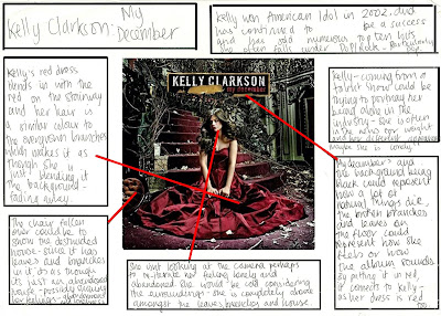
Here are two examples of Albums covers that i have analysed, Kelly Clarkson falls under the Genre of Pop/Rock and although No Doubt have songs that would also go under the same title, the band generally are classed as Rock or Ska, Gwen Stefani, the lead singer however is known as a Pop Rock Singer as a Solo artist so i found it useful to analyse these two covers.


My December, Kelly Clarkson


Tragic Kingdom, No Doubt


Filming.


On the 5th December, the group finally filmed our video, having been put off on previous attempts due to some of the actors not being able to attend the same dates.

Unfortunately i was unable to attend filming due to outside problems making it impossible for me to be there and also meaning that i sadly had no input within filming and helping to make decisions that were made during the day.

However in the lesson after the weekend of filming i was able to catch up with the group and see the final product of their filming as well as being able to hear about the problems they had to face and how they over came them.

I became aware of problems such as the last minute change in scene due to difficulty moving furniture at the original location, Aprils house, resulting in the actual scenes being filmed at Reena's house, this poses problems with space and the desired effects, Aprils house had been chosen due to the large seating areas which would have been perfect for the speed dating section in our music video. The group were able to decorate Reenas house accordingly and created a serene and relaxed atmosphere for the speed dating scene by replacing tables for a cosy indoor picnic. This postponed the time of filming and decreased the amount of time they had for filming in the daylight.


Overall the group filmed scenes inside the house, with the three prospective dates all suitably dressed according to their stereotype, also matching the collages previously made. Scenes outside of the characters walking down the road, this will enable us to have different angles at which we view each person and will also allow us to use different effects and transitions without making it repetitive and boring.

They also filmed the three dates, standing and close ups of them that we will be using at the beginning of our music video and throughout to make sure that the audience start to familiarise themselves with the characters and by using a medium long shot It mimicks a dream sequence used in many other Pop videos. It was to show the female protagonist comparing her three dates in their style and body language,in turn allowing the audience to compare them aswell.

Final Storyboard.

On Monday 23rd, we finally finished our storyboard, we finished all the drawings and made sure that each shot had annotations of camera angles, transitions and lighting.
Now we have finished the storyboarding we are able to see exactly how our video is going to be, every moment has been recorded which will make it easier for us to film and then eventually edit.

Our annotations;


Props!


In today's lesson we made one of our main props, the speed dating sign that shows the audience what is happening in our music video. The features of the sign that we decided were most important was that whilst conveying the information, it also needed to show some type of connection with the song lyrics, we made this possible by making features of the font have 'devil' connotations, for example the devil horns on the word 'Saucy' which relates to the line,
'The man is a dream, the devil did him a deal'
As well as the S in the word Speed having the stereotypical devil tail, in a triangle also connection the reference to the devil.
We decided that the font should be red since it could be relevant to Love= the couples dating and the eventual outcome of our video, The devil= red is usually the colour of any images of devils that you usually see and red could also represent danger which intertwines with the lyrics, that 'superman' could possibly be quite risky.