his is my last post, I hope that you have enjoyed reading about my experiences within A2 Media;
Here is our final Music Video:Bye!
Bye!
 and
and +of+LOOOOL.bmp)
During research the media technology I mainly used was the internet. Youtube 'Broadcast Yourself' was a huge part of my research for music videos, it is easy to find video clips and music videos that will help to show you the conventions of the genre and even other projects done by people at other schools, their media products. This means that I was able to achieve realistic views about what to ask in questionnaires becuase I had seen the typical shots, costumes, colours, effects etc. of the pop/rock genre.
Another tecnology used in the research and planning stage was music channels. Channels such as Viva, MTV and TMF will show all types of music videos, including pop whereas NME, MTV2 and Kerrang will show more Rock videos, this makes it easier to see videos in our genre and make notes on the conventions. When watching music videos on Youtube you can get more information than just watching tv, they have user comments which allow you to see peoples views and opinions on them, people may be censored slightly in order to abide to the websites rules, the still maintain the individual opions of the audience.


Music Video;
Our music video is the most important part of the production, this creates the basis of the two ancillary task.
The conventions that we have followed for our media are;
Digipak;
This is the second most important, it has to appeal to the audience visually since they will be purchasing the album depending on how it looks on the shelf.
The conventions I followed were;
Magazine Advertisement;
This is the second ancillary task and it is important to have a connection between this and the digipak however it cannot be too similar or it would be repetitive and may appeal less to the audience.
The conventions i have followed are;


Here are two of the clips that we recorded that contain personal opinions on our music video;
The General feedback to our music video was;
The Best Features;
This is my questionnaire for my Digipak:
Like my questionnaire for my music video this is handed out to 30 people, 15 males and 15 females. I will also post the results in a future post.
This is my questionnaire for audience feedback for my magazine advertisement:
Exactly as I did for the other two questionnaires I have handed them out and will be collecting them and posting the results in a post in the future.
This is the questionnaire for the feedback about our video: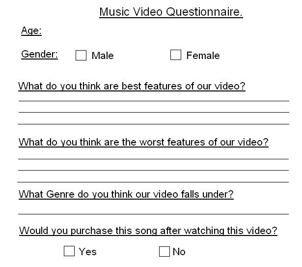
This was handed out to 30 people, 15 males and 15 females.
I will collect the results and post them in a future post.
 We used different varieties of researching from questionnaires, watching alternative videos and films in the same genres, storyboarding and more.
When it came to other media products we watched a lot of films/videos from films like Kidulthood and Adulthood to Blink 182’s ‘Always’ music video which we were directly inspired by and in fact attempted to use the three section dividing technique from it but were unfortunately unable to recreate this effect due to the programmes not being available to us. By watching other videos and films we were able to see the features and techniques that were used which we could then use on our own products to make sure that they followed the conventions of other videos/films in the same genres
that we had chosen.
This in turn helped us create questionnaires, we had some ideas that we had collected from our wider research and could make the questions more specific whilst still allowing people to have their own opinions for example a selection of music video effects, Blink 182’s ‘Always’ video split screen effect being compared with Powder’s ‘Up here’ cartoon to reality transitions. These types of questions will result with more detailed answers that are precise to our genre.


There were very few disagreements between the team members because individually we are all quite open people and were willing to listen to each others ideas whilst still inputting our own views. Its important to have a group that get along since its easier to make sure that everyone involved likes the final product, if members weren’t in a position to comment and get involved it could jeopardise our product since people that are uncomfortable wont be able to contribute as much as they might want to and could be depriving our product of their skills.
There will always be things that you want to change when you see the final product, problems with the setting could have resulted in the mishaps with the backdrop showing its edges in the clips since this would not have happened had we stuck to the original location. Things like the grainy image cannot necessarily be helped since we had limited resources and the quality of camera had its boundaries and our videos our bound to look less professional since we have only ever made two productions at school.
I think that if we were to do the whole thing again then it is likely that we will spend even more time on planning and research. I also think that filming will take more time since we did have to return and film again on another date, had we spent more time then we could have had more shots and replaced the bad ones with other options.
 This is my Magazine Advertisement.
Although i previously had finished my digipak, however after more research and also asking people what genre they thought my album cover was i have decided to change it once more, this is my FINAL digipak and i think that it is more 'Pop' than the previous two designs.

 These are the final two sides of my digipak;
 ock genre.


This album cover 'Pop' is very similar to my design, the colour scheme, the effects and the general points of interest all coexist with my ideas.
Minus the blue background rather than black the whole idea of the album is spookily close to mine, it has a portrait that is pink and has markings on it, near to sequins or glitter and the hair is very similar, whilst they use the idea of a different font like i tried to create, since this writing is very unique and i have never seen any other album covers with the same font, this makes the album cover more appealing since it shows they are alternative and don't follow the same ideals as everyone else, an image that i also tried to recreate.
This is the last side to my Digipak, its not very interesting since it just holds the CD, i think that the design of the CD will be important to and since it will be covering the majority of this side then it will be more of a necessity to be appealing than having a lot of images on this side.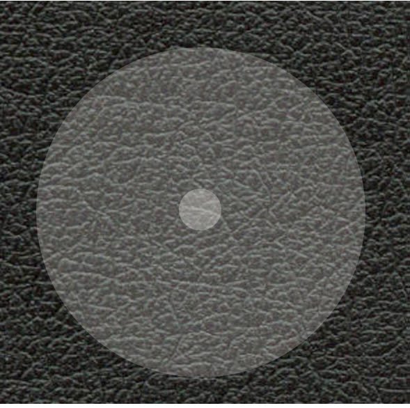
I will be posted a design for the CD at a later date, which will then be the focus of this slide.
 This slide is a single image but this has the word 'Blah' written in the same font as the title and band, these is to make sure that there are connections throughout the album cover, as well as just the images. I had used the letters in the exact same way as the cover but enlarged it more to make sure that the side wasn't to bland and empty.
I chose the word 'blah' since its a popular word to describe nothing, its used in other songs such as Ke$ha's 'Blah, Blah, Blah' this song is in the same genre and i thought it would be a relevant word that wont impose to much or take the attention away from the real name of the album and band.
I used the image that i had previously used on one of my original front cover designs, i didnt want the image not to be used and since its similiar to the other images it didnt create any problems by having it within the digipak, it also gave the image i like a bigger 'part' as it has writing on it so its marginally more important than the other two single images.
This slide isnt complete yet since i am waiting for results from a questionnaire on how the font and labels for the songs should be on the reverse of the digipak; For now i have ju st used an image that is facing the side, since it allows enough room for the titles of the songs and for the timings if its decided that they should be included. The majority of this side is the black leather so it could be said that its quite dark but i think that the pink face still contrasts with the black even though unlike the front cover its not an image of a full face. I also like this picture due to the effect of the sequins, its as though the face has Stars on it due to the reflection of the light and since there are no material things in this picture, like clothes it puts the image in a innocent and sparkling light. This is my favourite image since its interesting and alternative to all the other image which are quite similiar, however i could not of used this image on the front cover since its not very big and i do not think it would be appropriate for a Rock/Pop album cover since it doesnt follow the conventions of this genre.
I have made a template to show how my Digipak should be set out, this enables me to plan out which side should have which image. This also allows me to be able to print out my deisgn more easily, since i will be sure of which sides should be next to each other so that when it comes to folding it they are all in the right places.
These are the other sides to my digipak;

These two sides are the single image sides, they will be on both the outside and the inside of my digipak, these images, are similar to each other, they both have wide open mouths and like the whole of my album cover the image of 'Black Leather' in the background. The image of the wide mouth is to represent screaming, although our genre isn't hardcore rock or music that is traditional very shouty there are often tracks that are strong and loud and I chose these two images to represent that, I feel that people will look at them and imagine them to be powerful and positive shouting rather then violent or negative since I have taken measures to avoid that area of Album covers I.e. removing the Parental Advisory sticker.
I looked at these two designs and wanted to develop it further to make sure that i was 100% happy with my final product, this would be the most important side of my Digipak since it would be what was on view in shops and what people would take their first opinions of. I made a list of features that an album must have in order to stand out from the 1000's of other discs in shops;

The front cover of my album cover required the most attention and i in fact made two versions before i made the final product;
1. This idea is completely different to my final product, i used a different image for this design, one that was of Hasan without any face paint or glitter on and used editing instead, i think that it is very unclear and that it would have been a bad idea to use this image since when showing people they found it hard to actually work out what it was. I also think that there is too much pink borderline, it makes it look very amateur and also very childish, which isn't the image i wanted to portray on my cover. I also decided against having the parental advisory sticker since this gives the image of the album being quite negative and slightly cuts down the possible audience since there will be people that are put off by the possibility of expletives etc.
There is also a huge amount of the cover being taken over by the background to the font, which looks untidy and once again quite amateur so this is something i have removed in my further designs.
2. This is the second cover i made and it is very similar to the final product, i used the scrabble font and separated them all so that there wasn't a huge amount of the background colour distracting the cover like in the first attempt. By not having an image that isn't completely photoshop based means that there is a stronger image that people can see and recognise, a feature that wasn't apparent in the first draft. I also decided to use a 'Black Leather' background to make the album cover have more of a rocky edge, since before it seemed very indie. By using leather then the genre of the CD will be portrayed in a more relevant light and will also cohere with the conventions of this genre. I think that the lack of Parental advisory sticker means that the CD is friendlier and also helps to sell the album to parents and other people that may be concerned with the contents of the disc, allowing our Album to become available to a wider audience.
For the text on my front cover i didn't want to use a font that had been used on other album covers, especially since i wanted mine to be unique, for this i researched into many fonts online but none really fitted the image i had in my head.
In the end I decided to use Scrabble Letters, i set them up on my scanner and cut around them separately in photo shop. I think that this is effective since people will recognise the letters from the board game and it also hasn't been used on an album cover before.

In 'Faking It' I added an extra I as i was planning on turning it into an Exclaimation mark in photo shop but when actually trying this it didn't look very realistic so instead I decided to completely cut it from my writing.
I have decided on the name Constant Invasions for my band and the album will be called Faking It, Both of these names have been chosen from Lily Allen lyrics and are selections that I feel will fit in with our genre of Pop/Rock.
I asked a friend, Hasan Beyaz to pose for pictures that I could use for my Album cover, i decided i didnt want just a portrait since when looking at other album covers there are very few that just have a plain picture, effects are frequently used and make the cover more interesting.
We decorated his face with pinky/purple face paint and a lot of glitter, this made for interesting pictures. These are my favourite 9 pictures, I am pleased with the results as they came out exactly how I imagined them.


To help make my digipak the best it could be i have made a questionnaire to find out what people like/dislike and are/arent attracted to in an album cover. I handed out 30 copies of my questionnaire and here are my results;

Gender: The female to male ratio is very biased. There are only 9 males: 21 females which means that less then a third of my questionnaires will represent the male views on album covers. However i could use the fact that more females would prefer to listen to the band, due to the feminime lyrics and powerful lead female vocals.


When looking at Pop/Rock Album covers there was one band whose Album covers always stood out. All time low, an american band fall under the same genre as the song for our music video. Before researching about Pop/Rock bands i had never heard of them or any of their songs.
If i were to see these album covers in a shop then i definitely would have wanted to pick them up. They all vary in design,

This album cover is bright, it has three main colours; Yellow, red and Blue, contrasting with eachother they send off the image of summer, due to the yellow and red being warm colours and the blue as a very small section which could represent the sea or water, something that is strongly associated with summer ie. the beach. The black figures are bold against the background and they attract your first attention, its as if they are jumping, making it seem as though they are elated, perhaps at the album or even reiterating the point of summer since people are often happier in the summery months. The other feature of the cover is the birds that are flying across the whole cover, they fade at different parts and are consitent from one end to the other. These birds have no obvious relevance to the title or the rest of the album cover but its similiar to the colors since it is a contrast to the people and the images in the background. This album cover has features that are opposites crushed together, which makes it interesting and sets the cd off as unconventional which often results in the potential buyer more tempted to pick it up and have a look.
Nothing Personal, All time Low.

This is my favourite out of the three album covers. In a way its simpler then other two, yet more complicated! The image is like wallpaper that has been split into two, crushed in between is the bands name in a huge black block font and the album name as if it has been written by hand, it is very inferior to the band name. The other insides of the album cover include to our eyes random objects, the end of a pencil, an american cinema ticket, a pair of legs and a casette player are a few to name, none of the objects are in full yet we are still able to identify the majority of them. The objects are not bright coloured at all, they are all quite neutral tones that dont really leap off the cover yet it makes them all blend together making all the items flatter eachother and work well all together as well as seperately. There is also the repetition of the birds on this cover, like the 'so wrong its right' cover which could show that its a theme that the band are using to associate themselves to this image, in turn this could make a connection for fans, so that when they see the flock of birds they automatically think of All Time Low. I think that the fact they have such a simple yet busy album is fun and fascinating, as a potential buyer i would be curious about what else is there and why, by making the viewer think about what they are looking at has enabled the band to once again make an interesting and effective album cover.
Put up or Shut up, All Time Low.

The final Album by All time low, is equally as eyecatching as the other two. The main person in the front has no facial features and is the only one in colour, this could be as to not attract the viewers attention away from the album names situated above and on the man. I think that the contrast between the other people and the man in the middle creates an image of individualism and once again the unconventional side of the band because he isnt the same as the others and stands out, making sure that the person looking at the album cover sees the seperation in a positive light rather than negative. It has similar features to both the above, for example; just like 'Nothing Personal' this cover has a HUGE focus stealing band name and an understated, 'handwritten' title. Alike 'So wrong its right' it has bright colours that will stand out when its amongst thousands of other cds and albums in a shop. It appears that the band like to keep their album covers close to eachother by using a lot of the same effects; the birds, the fonts and the colours all show that the band has consistancy but still allows room for change so that the fans and buyers can see a comfortable changing band.
Im going to use All Time Low's album covers for influence when it comes to designing my own album cover and i hope that i can achieve the kooky and fun yet complimentary edge to my album cover like they have, three times!

